
This widget does not offer any functionalities to speak of. It allows the administrator to have access to a tool for classifying and grouping widgets in a well-defined structure. Certain properties can be applied to this widget and are listed below;
![[Note]](images/community/docbook/note.png) |
Note |
|---|---|
|
Properties:
|
The purpose of this widget is to facilitate the manipulation of widgets by suggesting how to regroup them.
Position the Aggregation widget in the portal, and then move the selected widgets on to it. Click on the  icon to view the group of aggregated widgets and edit their properties. To delete a widget from the aggregate group, simply
select it and click on the trash can in the Composer.
icon to view the group of aggregated widgets and edit their properties. To delete a widget from the aggregate group, simply
select it and click on the trash can in the Composer.
|
Note |
|---|---|
|
Properties:
|


![[Tip]](images/community/docbook/tip.png) |
Tip |
|---|---|
|
Available in mobile/responsive mode. |
The Home Page widget allows the user to return to the initial status of their mapping portal in terms of geographic position. If the user has consulted many different positions at different zoom levels, the simple fact of clicking on this functionality will bring them back to the initial view of the portal.
|
Tip |
|---|---|
|
The initial view corresponds to parameters that have been defined during step 4 of the mapping portal creation Wizard; the user indicates in the drop-down menu containing positions inherited from their Geoconcept map, whether they want the first connection to display a global view of the map, or one map position in particular. |
|
Tip |
|---|---|
|
Available in mobile/responsive mode. |
This button allows you to delete all the temporary elements displayed in the map, such as the vector objects, measurements of distances or areas, the drawing of polygons or even selections made. The option Enable selective reset of widgets allows to choose which widgets must be reinitialized (Query, Annotations, Geocoding, Isochrons, Route).

|
Tip |
|---|---|
|
Available in mobile/responsive mode. |
This functionality allows the user to exit from the portal and switch to a new internet page.
|
Note |
|---|---|
|
Properties:
|
Activating this widget allows you to apply a zoom to a rectangle plotted using the mouse in the web application. The facility to zoom with the mouse wheel and with the zoom cursor are available at any time in the application.
|
Tip |
|---|---|
|
Available in mobile/responsive mode. |
This functionality allows the user to exit from the portal and switch to a new internet page.
(fr) L’infobulle autorise la navigation entre les différents objets trouvés sous le clic ou en survol. Dans le coin inférieur droit de l’infobulle, quatre boutons permettent la navigation d’un objet à l’autre. Les deux flèches centrales ont pour rôle de faire défiler les objets un à un tandis que les flèches extérieures permettent d’accéder rapidement au premier ou au dernier des objets.

In addition, for objects stored in the Geoconcept map, it is possible to automatically retrieve the geometry of the object selected for it to display over the rasterised map.

(fr) La consultation des fiches peut être filtrée en fonction des couches affichées dans le portail pour ne choisir que les fiches d’objets appartenant à une couche en particulier.

|
Note |
|---|---|
|
Properties:
|
This widget serves to add a Layers manager. The layers are those defined in the Wizard. Through the intermediary of ths layers manager, the end user can choose the layer they want to display and refine and adjust its transparency.
The layers display exclusively. There are two possible scenarios:
- no group has been defined in the Wizard: all the layers appear at the place where the widget has been positioned. A click on a layer opens it in the portal.

- a series of groups have been defined: the name of the group appears at the place where the widget has been positioned. A click on one of the groups opens the list of available layers. The screen is divided up into as many layers as there are layers defined (if only one layer has been defined in a group, the layer displays directly). A click on a layer opens it in the portal.

In both cases, a horizontal slider allows you to navigate between the layer defined in the current view and the selected layer.
|
Note |
|---|---|
|
Properties:
|
|
Tip |
|---|---|
|
Available in mobile/responsive mode. |
This widget allows you to add a layer manager. The layers are those defined in the Wizard. Via the intermediary of this layers manager, the end user will be able to choose the layer or layers they want to display, the order or sequence in which they appear, and then adjust their opacity to achieve the desired effect.
This is a layers manager with a succession of layers that can be enabled as required by checking the relevant check-box. It will be possible to superpose several layers, one on top of another. The order of the layers can be modified by the end user.
Functionalities:
- Display or mask all layers with the check-box at the top of the layer manager
- Display or mask all layers at the level of the group with the check-box in front of the group name
- Fold or unfold all the groups and layers using + and - at the top of the layer manager
- (fr) Afficher une couche selon un filtre : les filtres peuvent être créés dans l’assistant (onglet Couches)
-
Re-order groups / layers using the
 tool
tool
-
Display all layer information by clicking on
 (opacity, metadata, legend)

Mobile
This Widget is available in mobile mode, it has a specific interface that does not allow any changes to be made to the order and transparency of the layers.

|
Note |
|---|---|
|
Properties:
The url for metadata is defined in the page for tiled layers, for vector layers, or for groups of layers, under metadata url. If the url has no value assigned to it, the “link” is not displayed in the layer manager.
|
This widget provides a functionality for switching the mapping application into full screen mode.
|
Tip |
|---|---|
|
Available in mobile/responsive mode. |
This widget enables users consulting a mapping portal to have access to a specific document. The addition of the document is defined in Documents lateral menu.
Once the map portal has been published, users can download the document with a click on the widget.
|
Note |
|---|---|
|
Properties:
|
|
Tip |
|---|---|
|
You can associate all types of documents: PDF, Image, Word / Excel / TXT files, etc. |
|
Tip |
|---|---|
|
Available in mobile/responsive mode. |
This functionality opens the messaging client to send an email to a contact, the email address for which, by default, has been configured in the @(Administration / Settings / Widgets / Mail / Administrator mail portal) menu@ section.
|
Note |
|---|---|
|
Properties:
|
|
Tip |
|---|---|
|
Available in mobile/responsive mode. |
The Text scale is a functionality that completes the graphic scale proposed by default when publishing a portal (it is located at the bottom left of the screen).
This Text Scale breaks down into two modes:
- the first in the form of a simple text display. Depending on the level of zoom at which the user finds themselves, the text zone indicates the scale in numeric format that will have been configured previously in the Geoconcept map via the user’s desktop solution.
- the second in the form of a list summarising all the scales configured as a function of the zoom level, as in the desktop version of Geoconcept. There are therefore 12 scales corresponding to the 12 levels of zoom that are proposed to the user.

|
Note |
|---|---|
|
Properties:
|

![[Warning]](images/community/docbook/warning.png) |
Warning |
|---|---|
|
|
Tip |
|---|---|
|
Available in mobile/responsive mode. |
This module enables the user to centre the map on an address that they will have entered earlier in the appropriate field.
The Geocoder widget can be configured in two ways:
- the user fills an Address field, and validates;
- the user inputs their address in a free field, and in parallel, the autocomplete module suggests a series of close match results as the text is input at the keyboard.
The configuration of the operating mode takes place in the widget properties.
For versions of Geoconcept Web later than version 5.2 it will be possible to specify several geocoding repositories, either one per country, or one per object typology (towns, management teams, …). Reminder: the Geoconcept Web Enterprise version is supplied with UGC Builder, that allows design of geocoding repositories).
|
Note |
|---|---|
|
Properties:
|

|
Tip |
|---|---|
|
Available in mobile/responsive mode. |
This is a widget enabling retrieval of the position of the mouse cursor and display of the coordinates. The administrator must define whether the user retrieves the coordinates of the point clicked, or the coordinates of a flyover. They must then specify the projection systems that the user could choose. By default, the coordinates displayed will be those of the current map.
If no system is chosen in this drop-down list, the coordinates will be displayed in the map’s system.
|
Note |
|---|---|
|
Properties:
|
|
Warning |
|---|---|
|
A graph or road network is necessary. |
|
Tip |
|---|---|
|
Available in mobile/responsive mode. For the specificities particular to this widget, consult the chapter called Mobile. |
This widget allows you to calculate a route between two points, adding if needed, extra intermediate route stops. The route calculated displays on the map in highlighted form, accompanied by a route sheet that summarises the various road sections to be followed.
There are two possible methods for creating a route;
- with a click / drag-and-drop: hold down the left click of the mouse, and then move the green flag in the direction of the desired start point, then perform the same operation with the red flag in order to show the finish point. As soon as the click is no longer maintained in the hold-down position, the journey is automatically calculated.
- entering addresses: fill the start address and finish address fields.
To add intermediate steps: perform a preliminary calculation and then click on the + button as many times as necessary.
From version 5.2 of Geoconcept Web and upwards, it is possible to specify several graphs and/or several vehicle profiles. The user then chooses the graph/profile of the vehicle desired in the interface, materialised by an icon. Reminder: the Geoconcept Enterprise desktop version allows you to construct graphs for the calculation of routes (.SITI).

|
Note |
|---|---|
|
Properties:
|
This widget takes you back to places consulted during a navigation session in the mapping portal.

|
Note |
|---|---|
|
Properties:
|
|
Tip |
|---|---|
|
Available in mobile/responsive mode. |
This widget is not a button, but a drop-down list that suggests all saved map positions in the current Geoconcept map. If the user clicks on a position, the map is centred on that position.
|
Note |
|---|---|
|
Properties:
|
|
Tip |
|---|---|
|
Available in mobile/responsive mode. |
This widget allows you to search around the centre of the screen (or around my position if the Geoclocalization widget is enabled) for objects sourced by vector layers previously chosen in the widget settings. The centre of the screen can be materialised with an activated cross thanks to the Centre widget.
The appearance of objects found via this search, depends on a default style (default style for a search around).
|
Tip |
|---|---|
|
If the required style needs labels (via an SLD configuration) you will need to enable the corresponding fields in the definition of vector layer fields, by clicking on Display. |
|
Note | ||
|---|---|---|---|
|
Properties:
|
When the widget is activated, a first window prompts you to choose in which layer the user wants to find the objects in the case of several vector layers.

The list of objects found nearby appears. One click on one of the lines in this list allows you to view the object and activate the infobox.
Properties in mobile mode: Once the layer has been chosen, the result number of objects found appears at the lower edge of the screen, along with a Display the list button. When you click on Display the list, a list appears showing for all objects, the name of the object, and the distance to it.

Clicking on one of the lines in this list provides access to the object information form and a view of all attributed information available for the object.

The Display the map button shows the position of the chosen object on the map. The Navigation button allows you to transfer the position of the object to a browsing application already installed on the terminal (Google Maps, Waze, HERE Maps, …).
The X button at the top right allows you to exit from this search and return to the Home screen.
|
Tip |
|---|---|
|
Available in mobile/responsive mode. |
|
Warning |
|---|---|
|
Please note that due to a change in behaviour in the latest versions of most browsers, this widget will only function on portals using the https protocol. |
This widget centres the map on the current user position. It can be used both on traditional type portals and on mobile terminals using either HTML 5 tags, or information about positions supplied by WiFi routers or again by GPS coordinates returned by various devices. A click on the widget or pressing on it will activate or de-activate it.
The specific configuration for mobile terminals is defined in Widgets mobile window.
|
Note |
|---|---|
|
Properties:
|
|
Note |
|---|---|
|
Properties of the mobile tab:
|
|
Tip |
|---|---|
|
Available in mobile/responsive mode. |
This widget serves to display a layer that is not displayed. On activation of this widget a circle (porthole) follows the movement of the mouse and appears on the map.

|
Note |
|---|---|
|
Properties:
|

|
Tip |
|---|---|
|
Available in mobile/responsive mode. |
Creating the screen shots requires certain parameters. By default, the Geoconcept web installer creates the parameters and the necessary sub-directories under “C:\Geoconcept Web” designated as “<DATA_HOME>” below. These filepaths can be changed by modifying the following values in the section.
- Documents path directory indicate the full filepath to the directory in which the screen shots generated are temporarily stored, default: “<DATA_HOME>\data\documents”,
|
Warning |
|---|---|
|
When using a large number of images and/or formats the consume large amounts of memory (BMP,…) in particular if the portal displays rasster images (scan, orthophotos, …), it can pove necessary to increase the size of exchange files from the administration console in Geoconcept Web Map. In the tsb General section Settings Increase default value 4096 to 409600 or more, and restart the Geoconcept Web Map Service. Exercize caution, however, if there is a high number of users with simultaneous access. |
The Screenshot widget serves to perform an export of the map in the form of an image. The latter will be saved in a directory that the user will define. By default, the screenshot will take the whole of the map’s footprint and save it in .png format.
|
Note |
|---|---|
|
Properties: When the mapping portal is published and the “Screenshot” widget is activated, a new window proposes the following parameter settings to the user:
|

|
Tip |
|---|---|
|
Available in mobile/responsive mode. |
This button offers the user an option to obtain a link on the map in its current configuration, that is, while conserving the current position as well as the layers displayed, and taking into account their transparency.


From version 5.2 of Geoconcept Web onwards, the links generated are shortcuts and take the following structure:
http://[adresse du serveur]/[nom du projet]/easy/public/map2?token=0b737eb0-a14e-43a1-964b-c8912acb34e3.
The token is stored in the database in the gw_egw_map_context table with its associated description in JSON format.
Links generated with previous versions remain functional.
|
Note |
|---|---|
|
Properties: To activate on a case by case basis:
|
The Print button opens a image version of the map in a new browser tab (in JPG format). It is then possible to add a title to the defined text zone.
In the case where the user has opened an infobox on an object just before clicking on the Print button, this infobox is retrieved by the print tool and positioned to the right of the map for printing. The legend is also retrieved and displayed in the printout.
The Print button can be used to print the page via a printer, or to create a PDF via a PDF printer.
|
Tip |
|---|---|
|
Available in mobile/responsive mode. |
This tool allows a user to create a PDF file of the map.
The frame sets delimiters for the print area. When you click on the frame, it can be resized or moved using the mouse.
|
Note |
|---|---|
|
Properties:
|
When creating the PDF file, the user can choose the following options:
- Name of the PDF file: optional. If this field remains empty, a default name will be attributed,
- Title: this serves to assign a title to the document,
- Comment: a comment line can be added to the PDF, Disposition Section
- Paper size: allows you to choose the print format as A4 or A3, depending on the templates suggested by the administrator.
- Orientation: allows you to choose the orientation of the paper as Portait or Landscape, as a function of the templates suggested by the administrator,
- Scale: this serves to define the print scale, by typing in the value in the text field. The Enter button at the keyboard, or the button validates the scale entered,
- Image quality: this allows the user to choose the image quality generated in the PDF (low: 100 dpi, standard: 200 dpi, enhanced: 300 dpi). Display Section
- Graphic scale: allows you to add a graphic scale
- Numeric scale: allows you to add a numeric scale to the PDF,
- Date: this option adds today’s date to the document,
- North arrow: displays a North arrow in the PDF
- Legend: this serves to add legends to the PDF. When this box is checked, the user needs to then select which legends need to be printed (selecting from all the legends for the activated layers),


|
Tip |
|---|---|
|
In the Geoconcept page layout, the elements must have the following names, in order to be taken into account when the PDF is generated:
These components are not necessarily present in the page layouts supplied with Geoconcept Web, so they should be added if necessary by editing the page layout XMl file. If one of the elements Format, Orientation and with or without Legend is not present in the page layout templates, it will not be possible for the user to activate it. For example, if there is no page layout template available in A3 format, then the A3 button cannot be activated. |

It is possible to import external data in .kml format into the Geoconcept Web portal. To dislay these data, click on the widget and then on the button to select the file to import. Then click on to validate the import. The layers manager (simple or advanced) indicates a new line with the name “KML”.
|
Warning |
|---|---|
|
The addition of KM data is temporary: no saving of data imported will be performed. If the user wants to refresh the internet page, the KML data will have disappeared during reloading of the mapping portal. It will then be necessary to restart importation if the data must be displayed again. |
|
Tip |
|---|---|
|
Available in mobile/responsive mode. |
The Web Portal widget enriches the project by giving it one (or several) access points to other platforms hosting geographic information. To activate this functionality, the user must first define the external datasource in the Composer that they wish to use.
When the portal is published, the widget functions in two stages:
- A first left-click on the widget to activate the functionality,
- A second mouse-click on the map opens the datasource defined previously in a new window.

|
Note |
|---|---|
|
Properties:
|
|
Tip |
|---|---|
|
Available in mobile/responsive mode. |
This widget opens a URL in a new browser tab. It is used in two distinct ways:
- either a click on the widget opens the URL supplied under properties,
- or, a click on the widget allows you to activate it, and then a click on one of the objects in the Geoconcept map opens the URL supplied in a Class/Subclass/Field in the map.
|
Note |
|---|---|
|
Properties: If dynamic URL is not checked:
If dynamic URL is checked: the URL opens when you click on the map object as a function of the following properties:
|
|
Warning |
|---|---|
|
Available as a function of the version of Geoconcept Web |
This widget allows the user to consult files in PDF format associated to a layer of geographic data.
Publishing of reports can be accomplished:
- either from the Geoconcept GIS (via the menu option / Links / Webmaps / Publish);
- or from the Reports lateral menu in Administration.
Having published the reports in Geoconcept, where the user will have taken care to indicate which project the PDF reports are to be associated with, the documents can be consulted in one of two ways:
- by activating the Report Widget
Once the cartographic portal has been deployed, the user can click on the Report icon. A new window opens and shows the list of pdf documents associated to the cartographic project consulted.

The user can sort the documents by clicking on the headers of each column so as to apply a sort in increasing or decreasing alphabetical order. Clicking on one of the red PDF icons (the right-hand column in the table) will start the process of downloading the associated document.
Depending on the configuration of your internet browser, the PDF file downloaded recently will open automatically. If it doesn’t doe this, it will be necessary to go into the Downloading directory to open the file manually.
|
Tip |
|---|---|
|
Important note: The name of the report must be unique. You can, of course, customise it to achieve a more readable display, by adding an underscore character "_" after the identifying part of the name, followed by the relevant string. For example, if the file is called "81005-001_Hospital.pdf" it is displayed in the report table as "Hospital". |
|
Note |
|---|---|
|
Rights:
|
Another way of consulting a report is to interrogate a geographic object via the Infobox function. To gain access to the PDF document, the following three conditions must be fulfilled: verify as follows
- Has a report been associated to an object on the Geoconcept map?
- Has the reports field created in the Class / Subclass of the data layer been activated in the Geoconcept mini-information form?
- Has the report title been defined in the reports field?
|
Warning |
|---|---|
|
Important note: The name of the report must be unique. |
If both these conditions have been fulfilled, the user must ensure that the data layer where the reports are associated is visible (checked) in the their project.
Clicking on the Infobox widget, the user can, by left-clicking on the geographic object, open the infobox form.
The PDF icon, when clicked on, allows the user to download the report associated to this object.

|
Tip |
|---|---|
|
Creating an Alias for the 'Reports' field In the Composer, the user can modify the name of the field indicating the presence of a report when this is displayed in the infobox or popup (tooltip) of a geographic object. For this to happen, the user must select the Tooltip widget and then click on and change the name of the report field with the alias of choice. |

|
Tip |
|---|---|
|
The Saved queries Widget is available in mobile/responsive mode. |
Before you can exploit this functionality, one or several vector layers must have been created from Administration / Layers / Vector layers.
|
Warning |
|---|---|
|
Take care about the number of selected fields to display in the query result. The higher the number of fields to display, the slower the query will be to process and display. |
Query
The Query widget allows you to query objects contained in the different layers that have been defined previously. The queries are then performed 'on the fly'.
The user clicks on the widget and a window proposes a choice of:
- the data layer to consult,
- the style to associate to the result.
The next step is to construct the query. The query is built according to attributed and/or spatial criteria. The first tab allows you to define the field, the operator, the value. The second tab allows you to define the geographic parameters (Reference object, spatial operator…).
The Attribute query tab suggests the choice of a field, an operator, and a value. The button helps the user by suggesting the list of unique values for the query field.
Once the parameters have been chosen, the button validates the choice. Queries can also be combined.


|
Tip |
|---|---|
|
Searches may be performed on fixed intervals. For example: selection of objects with a field value of today
selection of all objects for which the field value is less than one month
… |
The Spatial query tab serves to create a "topological" query, i.e. one that is based on one or more existing objects. The objects to search for can be included in the reference object, intersecting the reference object or objects, or located at a particular distance from the centre of the screen.
|
Warning |
|---|---|
|
Caution, a query created via the Query widget will not be saved. To do this you will need to go into the Queries lateral menu in the Designer. |
Each query executed generates a result table that contains attributed fields that will have been selected previously. It is possible to add, for the numeric fields, a calculation line (count, minimum, maximum, median, average, sum). This table can be exported in .csv or .xls format.

Finally, the user can modify the values of one or several objects sourced by a database. To edit the information, you need to click on one of the record lines in the table of results that you want to modify. When the line has been selected, it is highlighted in green. Clicking on the , a new window opens containing the “business specific fields” of the database, and enables editing of the information attached to the selected geographic object.
Once the modifications have been made, simply click on the button to validate the changes that will be applied directly in the dedicated table in the database, or click on the button to exit from the POI editing session without saving the modifications made.

Saved queries
This widget allows users to use queries pre-saved by the administrator from the lateral Queries menu in the backoffice. The user chooses in the list the query to execute, and obtains a table of results as with the Query widget described earlier.
(fr) Dans les propriétés du widget, il est possible de gérer l’ordre d’affichage des requêtes en les déplaçant par cliquer-glisser.
|
Tip |
|---|---|
|
Available in mobile/responsive mode. |
Before you can exploit this functionality, one or several vector layers must have been created from Administration / Layers / Vector layers.
The operation of this widget is identical to the button described in the query widget. This allows you to open an editable form of a vector object when you click on it in the map. Only vector layers configured for this widget by the administrator are editable. It is possible to use several widgets of this type in a single portal, linking them to different layers.
|
Tip |
|---|---|
|
The chapter called Administration / Layers / Vector layers describes how to configure the form (fields to display, to protect, sequencing, input mandatory or not, …). |
|
Note |
|---|---|
|
Properties:
|
This permits display of the current list of selected objects, either using a query, or using manual selection. The list can be closed and reopened so long as the objects are selected on the screen.
These widgets offer a selection functionality for point type vector objects by plotting a shape superimposed on the map. All objects present in the selected zone are then displayed in the map, along with the associated table.
(fr) cliquez un par un sur les autres fichiers à sélectionner. Vous souhaitez sélectionner tous les fichiers d’un dossier : Enfin, pour sélectionner tous les fichiers d’un dossier, utilisez simplement le raccourci clavier Ctrl + A.
There are two possible operating modes for this functionality:
- a class of objects is already displayed in the cartographic portal: objects can only be selected in the Class already displayed using the selection tool
- no object Class is displayed in the cartographic portal: using a selection tool makes it possible to select objects from all the available Classes
|
Tip |
|---|---|
|
Avaiilable only if the Manage objects option is enabled (functionality available in versions up to version 7.5). |
This widget makes available a functionality for displaying vector objects. The categories of vector objects are displayed in the form of menus with a drop-down list that catalogues the classified types for each of them. A click on a type of vector object allows display in the map of the said objects, superposed on the map. This feature also allows all vector objects to be displayed in a table when they are displayed in the map interface.

These widgets allow the user to dispose of access rights, and to create, modify, or delete vector objects directly from the mapping portal.
For each of the creation widgets, the administrator determines a single layer. It is therefore necessary to create as many creation widgets as there are layers to edit. After creation of the object, the object form opens so the user can fill in values for the fields, and it is also possible to use an external form by calling it with a URL.
|
Tip |
|---|---|
|
To be edited, a layer must be visible in the portal. The user must be able, via the advanced layer manager widget, to display the layer to edit. |
|
Tip |
|---|---|
|
Vector object selection tools or queries allow display of the Search result search result table. In this table, the button can be used to edit object attributes directly. To restrict editing rights in the Search result table, you will need to define editing rights for each vector layer, using the |
|
Note |
|---|---|
|
Properties:
|
This widget allows the user to create a vector object in the shape of a circle. An areal vector layer must be already present. The administrator defines a single vector layer attached to the widget.
Following activation of the widget, a click in the map allows you to define the centre of the circle. If the Draw radius manually option is checked, then a window prompts the user to enter the value of the radius, and if not, a second click allows you to define the circle radius with or without display of the radius (the option below).
|
Note |
|---|---|
|
Properties:
|
This widget allows the user to create buffer zones around selected vector objects (points, lines, polygons). A polygon vector layer must be available in the project at the outset. The administrator defines a single vector layer attached to the widget.
The first step consists of selecting one or several vector objects. A click on the Create buffer zones widget causes a window to open in which the value of the buffer zone can be entered.
(fr) La couleur de la zone tampon peut être définie dans les propriétés du widget.
This tool allows you to move a line object, polygon or point, to re-size a polygon or line object, or to rotate a line or polygon object. The objects concerned belong to vector layers defined in the widget properties.
Activating this widget has the effect of transforming the cursor into a hand. Clicking on an object, square handles appear around the object: the cursor transforms into a double-arrow which can be used to re-size the object with a click-and-drag mouse action. Rotation is performed by clicking on the round handle situated at the bottom right of the object.


A simple click-drag-drop action moves the object.
|
Note |
|---|---|
|
Properties:
|
Once the widget has been activated, a single click on an object allows the user to request deletion of the object. A confirmation message is suggested if this option has been selected under the widget properties.
|
Note |
|---|---|
|
Properties:
|
This tool allows you to edit polygon or line object geometry. For a point object, this is equivalent to moving the object. Once the widget has been activated, you need to click on the object and move along the line or polygon outline in order to either create an intermediate construction point, or move an existing point, or create a new construction point, holding down the Alt key while you click on the object.

|
Note |
|---|---|
|
Properties:
|
(fr) Cet outil permet de dupliquer le ou les objets sélectionnés.
|
Note |
|---|---|
|
Properties:
|

![[Important]](images/community/docbook/important.png) |
Important |
|---|---|
|
To use thematics, it will be necessary to:
|
The Thematics widget opens a dialogue box divided up into two sections.

The first section on the left allows choice of the information layer to be treated, that is:
- the Class and Subclass of objects containing the information to treat in thematic cartography with the help of two drop-down lists;
- the indicator allows you to choose in the list of fields carried by the chosen Subclass, the indicator to process. Click on the + button to validate the choice.
|
Warning |
|---|---|
|
Click on the |

The right-hand section shows the different parameters for construction of a thematic analysis. Three display modes can be used to map the qualification data.
Analysis by colour gradient

Clicking on the  button, the dialogue box adjusts the parameters to define.
The statistical method suggests choosing between two kinds of range analysis, one breaking down the statistical series into
equal fill ranges, and the other, equal width ranges.
The number of ranges must then be entered using the + or - buttons, or directly in the text entry zone. A choice of colours,
using the brush provided, enables selection of the colour gradient to apply. The colour gradients possible, as suggested in
the colour palette, are adjusted as a function of the number of ranges chosen.
button, the dialogue box adjusts the parameters to define.
The statistical method suggests choosing between two kinds of range analysis, one breaking down the statistical series into
equal fill ranges, and the other, equal width ranges.
The number of ranges must then be entered using the + or - buttons, or directly in the text entry zone. A choice of colours,
using the brush provided, enables selection of the colour gradient to apply. The colour gradients possible, as suggested in
the colour palette, are adjusted as a function of the number of ranges chosen.
A summary table shows one line per range associated to the colour assigned to the range. Each of the bounds can be edited to adjust the values as required.
Analysis with proportionally sized symbols
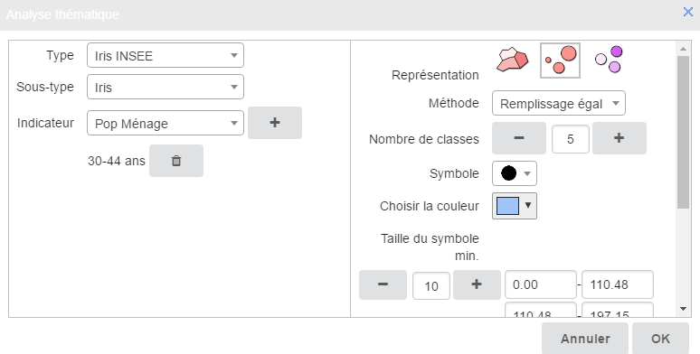
When you click on the  button, the dialogue adjusts the parameters to define. The statistical method suggests choosing between two kinds of range
analysis, one breaking down the statistical series into equal fill ranges, and the other, equal width ranges.
The number of ranges must then be entered using the + or - buttons, or directly in the text entry zone. The symbol shape is
chosen in the list of simple symbols proposed. The colour palette is used to select a colour for the chosen symbol. The range
bounds are editable with a view to adjusting the values. Finally you will need to assign the size of the smallest symbol,
and so the one corresponding to the first range, before assigning the size of the largest symbol, or that corresponding to
the last range. The + and - signs scroll the size values for the purpose of selection. They can be edited manually.
button, the dialogue adjusts the parameters to define. The statistical method suggests choosing between two kinds of range
analysis, one breaking down the statistical series into equal fill ranges, and the other, equal width ranges.
The number of ranges must then be entered using the + or - buttons, or directly in the text entry zone. The symbol shape is
chosen in the list of simple symbols proposed. The colour palette is used to select a colour for the chosen symbol. The range
bounds are editable with a view to adjusting the values. Finally you will need to assign the size of the smallest symbol,
and so the one corresponding to the first range, before assigning the size of the largest symbol, or that corresponding to
the last range. The + and - signs scroll the size values for the purpose of selection. They can be edited manually.
Analysis with symbols of the same size, and with a colour gradient

When you click on the  button, the dialogue adjusts the parameters to be defined.
The statistical method suggests two ways of breaking down the statistical series into ranges: there is a choice between equal fill or equal width ranges.
The number of ranges must then be defined using the + and - buttons, or directly in the editable zone.
The symbol shape is chosen in the list of simple symbols proposed as being available.
The size of symbole chosen must be attributed using the + or - buttons or directly in the editable zone. The choice of colours
allows, with the use of the paint brush, a choice of a colour gradient to apply.
The colour gradients in the colour palette are adjusted as a function of the number of ranges chosen. The range delimiters
or bounds can be edited so the values are modified.
button, the dialogue adjusts the parameters to be defined.
The statistical method suggests two ways of breaking down the statistical series into ranges: there is a choice between equal fill or equal width ranges.
The number of ranges must then be defined using the + and - buttons, or directly in the editable zone.
The symbol shape is chosen in the list of simple symbols proposed as being available.
The size of symbole chosen must be attributed using the + or - buttons or directly in the editable zone. The choice of colours
allows, with the use of the paint brush, a choice of a colour gradient to apply.
The colour gradients in the colour palette are adjusted as a function of the number of ranges chosen. The range delimiters
or bounds can be edited so the values are modified.
Click on the button and the thematic analysis is created with the legend displayed at the bottom right of the screen.
|
Warning |
|---|---|
|
Using the project Composer, activate the Advanced layers manager in the standard widgets to view the thematic layer constructed earlier. |
This function calculates isochrones or isodistances, either by clicking in the map, or from one or several selected vector
objects.
You can also create several isochrones or isodistances (to a maximum of 5) in a single operation.

In the Composer, you can choose certain options that will appear subsequently during creation of the isochrone.
|
Note |
|---|---|
|
Properties:
The Road networks parameter available in the 1st isochrone button allows choice of the road network on which the isochrone calculation is to be based. For each of the 3 buttons available in this widget, you can define the Label name but also the text displayed in the Button infobox. |
The first button creates isochrones or isodistances. If no object has been selected, a click on this button transforms the cursor into a cross that is then used to click on the map at the chosen location to set the start point for the isochrone.
The configuration window then allows you to choose the options, and notably to choose between Isochrone and Isodistance.

The next step is to type in a distance or a time and choose the colour of the isochrone.
The + button allows you to validate the choice.
The - button allows you to delete the choice of creation of an isochrone.


The Smoothing and Holes parameters are visible if these options have been made accessible in the widget settings window via the Composer.
(fr) Pour sélectionner un isochrone, il faut utiliser le widget Sélection par rectangle (ou par cercle ou par polygone) disponible dans la famille Sélection de données.
(fr) Pour supprimer un isochrone, il faut utiliser le widget Supprimer des objets vectoriels disponible dans la famille Edition de données.

|
Tip |
|---|---|
|
Available in mobile/responsive mode. |
This widget allows you to trace a series of temporary segments on the map. The length of each of the segments, as well as the total distance covered by all the segments, display in a dialogue box.
|
Note |
|---|---|
|
Properties:
|
|
Tip |
|---|---|
|
Available in mobile/responsive mode. |
This widget allows you to measure a temporary polygon on the map. The polygon displays in a dialogue in square metres (m²) and then in square kilometers, as a function of the size of the area measured, or in ares (a) then in hectares (ha) as a function of the size of the area measured.
|
Note |
|---|---|
|
Properties:
|

|
Tip |
|---|---|
|
Available in mobile/responsive mode. |
|
Warning |
|---|---|
|
The utilisation of the Note Widget requires that certain configurations described in the Lateral “Note” menu |
The Notes widget consists of two buttons:
-
the first
 activates or de-activates the display of notes that have been created in the portal,
-
to create a note, a second click is needed on the
 button. Clicking on the latter, the user can add a new 'Post-It' OR if a note has already been created, edit the latter and modify its content.
If the user creates a new note, a window will open allowing you to enter:
button. Clicking on the latter, the user can add a new 'Post-It' OR if a note has already been created, edit the latter and modify its content.
If the user creates a new note, a window will open allowing you to enter:
- the name of the author,
- in the 'Entity' field, if this has been configured in the widget properties, an information item sourced by the Geoconcept map can be automatically uploaded if you indicate the Class /Subclass in which it can be found.
- create a description,
- append a screen shot,
- import a document such as a photo, a PDF file or files in other formats.

Mobile
In mobile mode, the creation of a note differs a little, as in effect the activation of the Note Widget immediately authorises the input. Otherwise, for the rest of the procedures, the behaviour is identical to classical mode.

When the note has been created, it will display on the screen with the visual characteristics assigned when defined in the preceding steps. To de-activate the notes creation mode and hide all the elements appearing on the map, click again on the Notes widget.
Once a 'Post-It' note has been created, the administrator can access the note in the Geoconcept Web Administration, in the Designer tab, and then in the menus. In this dialogue you will find the tools needed to filter all existing records, and to view the content of each 'Post-It item. Changes can also be made to content: for example, changes to status (which will automatically and simultaneously change the appearance in the portal), or choose another action; the user can also consult file attachments uploaded by users, or see the history of processing operations on the note and track step-by-step the details of changes made to notes.
|
Note | ||
|---|---|---|---|
|
Properties:
|
The Annotations widget is a functionality that allows you to annotate, draw, highlight information relating to the portal. It is possible to incorporate text, points, lines, as well as polygons that can be customised by the user as required (colour, thickness, font size).
The widget consists of a single button that when activated, is used to offer a range of annotation functions:
- creation of a point,
- creation of a line,
- creation of a polygon,
- creation of a text zone,
- addition of points to a line or a polygon,
- moving an annotation created (geometric or text object),
- deletion of an annotation,
- customisation of an annotation.

|
Note |
|---|---|
|
Properties:
|
|
Note |
|---|---|
|
In a portal, holding the SHIFT key pressed down, users can draw the annotations in either 'freehand' or 'lasso' mode. |
This widget allows you to insert text in a web portal and to easily edit its appearance (colour, italicm bold, underline, etc) from the "Text" tab. it also enables display of the text in a dynamic manner:
- either from defined variables;
- or by retrieveing the values from fields of an object at the centre of the screen;
- or by displaying the label for the active layer.
Defined variables
These variables need defining from the lateral menu Predefined text from the backoffice, and to be called from the "Text" tab by indicating the Name to display the associated value between two accolades as follows: {TITLE OF PREDEFINED TEXT}
Object at the centre of the screen
From the "Text" tab, click on the button to determine the Class, the Subclass and the Field. When the map moves, the text is updated dynamically, and displays the content of the field for the object situated at the centre of the screen. It can be used in this way, for example, as a localiser to permanently display the name of the town corresponding to the map position.
Active layer
From the “Text” tab, click on the button. Used in tandem (simultaneously) with the single layer manager, it displays the name of the active layer.
