The widget is a graphics interface component (any kind of HTML/JavaScript type element) and is also a tool enabling retrieval of information via the server, or an internal/external datasource.
The advantage of using widgets is that custom client components can be designed without having to alter the Easy Geoweb code. A widget must therefore be interpreted by the client in a generic and autonomous way.
This chapter presents details of the composition, dependencies, and configuration of widgets.
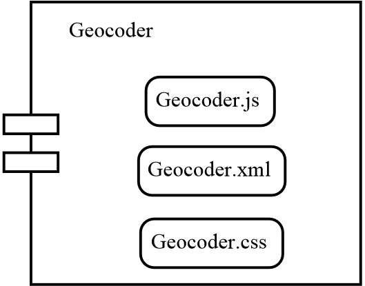
Each widget is independent of any others. It is made up of an XML description file, a JavaScript source file, and a CSS style file:
The client is composed of a widgets manager at JavaScript level, and is extended and enhanced with a series of widgets.
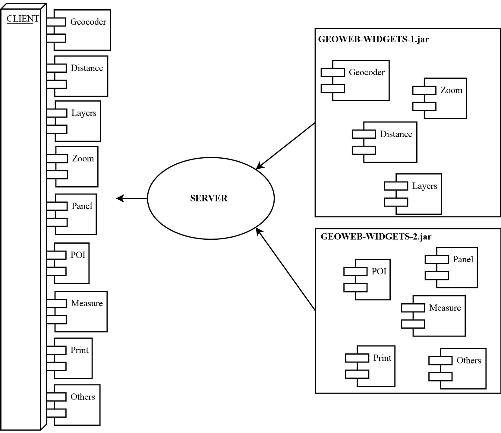
The principle is to describe the widget via an XML configuration file that will point towards the corresponding source file. When the widget is loaded by the widgets (server) engine, this will parse the XMl file in order to extract from it the necessary information. It will put these information items in JSON format, and return it to the client.
The XML file is a widget description file. It is parsed by the widget engine in order to extract information that will be of use to the widget engine, this information then being returned to the client in JSON format. This file must respect the same rules for all widgets:
-
id: the widget ID must be unique -
icon: the related filepath (in relation to the jar) of the widget icon -
js: the corresponding source file -
module: the YUI module for the widget, which must be unique, and identical to that of the source file -
display: the widgets can inherit other widgets or YUI classes that we don’t necessarily need to display, this attribute allows us to specify if the widget is to be displayed in the builder/portal or not -
groups: groups define which users will have access to the widget in the case of a private portal. Groups can be defined directly in the design tool. -
lang: the resources file allows internationalisation of the widget. The filepath refers to a properties file. In the example below, the file searched for is by default resources/widgets.properties. A widget can support several languages, for example resources/widgets_fr.properties or resources/widgets_en.properties. The language will be displayed as a function of the browser language. -
category: the category allows you to define the positioning of the widget in the designer library. If this field is not filled, the category will be defined as a function of the directory in which the widget will be stored. The list of categories is available in the EasyGeowebCategories.xml file. From this file, it is possible to add new categories (see the list of categories). -
position: The field position allows you to define the positioning of the widget in the widget library. If this value is not filled, the widget will be placed at the end.
<widget id="geocoder"
        category="navigation"
        position="1"
    icon="images/geocoder.png"
    js="view/GeocoderWidget.js"
    module="geoconcept-widget-geocoder"
    display="true"
        groups="Standard"
        lang="resources/widgets">
</widget>
It is possible to add properties to configure the widget in the designer in the XML file. Depending on what has been entered, the properties are generated automatically in the widget configuration window in the composer.
The property label displayed is structured as follows: "widget." + widget id + "." + property id. The value to add in the properties file is, for example, "widget.geocoder.mode=Mode d’affichage".
The params field allows you to define a default value for the property:
<widget id="geocoder"
                category="navigation"
                position="1"
                icon="resources/images/Geocode_32.png"
                js="navigation/GeocoderWidget.js"
                module="geoconcept-widget-geocoder"
                display="true"
                groups="Standard"
                lang="resources/widgets">
        <properties>
                <property id="mode" type="radiobutton-2">
                        <params value="0"/>
                </property>
        </properties>
</widget>
Here is a list of properties available for the widgets:
-
checkbox: handles true or false values.
<property id="checkboxProperty" type="checkbox">
        <params value="true"/>
</property>
-
text: handles text values.
<property id="textProperty" type="text">
        <params value="default text"/>
</property>
-
slider: handles numeric values. Maximum values are defined by min and max. The selected value corresponds to value.
<property id="sliderProperty" type="slider">
        <params min="1" max="12" value="6"/>
</property>
-
colorpicker: handles hexadecimal values.
<property id="colorpickerProperty" type="colorpicker">
        <params value="#ffffff"/>
</property>
-
combobox: handles text values. The list of available values is based on thegetComboboxOptionsandsetComboboxOptionsmethods (see the widgets API).
<property id="comboboxProperty" type="combobox">
        <params value="comboboxValueName"/>
</property>
-
datagrid: handles text values. The default values are separated by ; characters. The list of available values is based on thegetDgOptionsandsetDgOptionsmethods (see the widgets API).
<property id="datagridProperty" type="datagrid">
        <params value="datagridValueName"/>
</property>
-
radiobutton-2: handles numeric values. Possible values are 0 or 1. To display a label on each radio-button, you need to add 2 keys in the properties file, ending them with ".left" and ".right"
<property id="radiobuttonProperty" type="radiobutton-2">
        <params value="0"/>
</property>
-
checkbox-2: handles numeric values. Functions in an identical manner to the "radiobutton-2" property, except that it is possible to select both the property values.
<property id="checkbox2Property" type="checkbox-2">
        <params value="0"/>
</property>
Each of these properties can then be used in the widget using the getPropertyValue method (see the widgets API).
A series of categories are defined in a project configuration file EasyGeowebCategories.xml.
Each widget is dependent on one of these categories. To do this the widget must be placed in a directory bearing the name
of a category. Example: our geocode widget is placed in the file navigation/Distance.js,and it then belongs to the navigation category. The distance widget is placed in measure/Distance.js therefore it belongs to the measure category.
It is possible to add new categories in EasyGeowebCategories.xml. To do this, simply add a tag entry. key allows the user to define the positioning in the accordion display.
<properties>
        <entry key="0">layout</entry>
        <entry key="1">general</entry>
        <entry key="2">navigation</entry>
        <entry key="3">view</entry>
        <entry key="4">measure</entry>
        <entry key="5">annotation</entry>
        <entry key="6">data</entry>
        <entry key="7">modification</entry>
</properties>
The name of the category allows you to handle internationalisation. For example, for a new category named graphic, you need to add the following key in easy.properties
accordion.category.graphic = graphique
The JavaScript file is the widget source file. This will be loaded by the combo to be injected in the client. Here is an outline source file:
YUI.add("module-name", function(Y) {

        function WidgetClassName(config) {
        WidgetClassName.superclass.constructor.apply(this, arguments);
        }

        WidgetClassName.NAME = "WidgetClassName";

        Y.extend(WidgetClassName, Y.GCUI.WidgetBase,  {
            initializer: function(config) {
            },

            destructor: function() {
            },

            getWidget: function() {
                // return html description widget
            },

            configureAction: function() {
                WidgetClassName.superclass.configureAction.apply(this);

                // some actions
            }

        });
        Y.namespace("GCUI");
        Y.GCUI.WidgetClassName = WidgetClassName;

}, "1.0.0", {requires: ["project-widgetbase"] });
The getWidget() function will be called in the first place by the WidgetManager (client) to display the widget. This means that this method
returns the representation of the widget. It may contain all that the developer wants to display. The only constraint is to
remain in an HTML tag <div></div>.
In effect, the widget will only be displayed if it is contained in this tag.
WidgetBase displays TreeView, listbox and combobox (and so on) items.
The configureAction() function will be called by the WidgetManager to configure the widget once it has been inserted in the DOM.
WidgetBase suggests a series of basic functions forming the API of widgets. So, all widgets have access to the map, to the detail of the project, but also to a panel that one can use to display diverse
information items.
All widgets inheriting from WidgetBase possess default properties: Display of the label, a label designating a label, and display of a label separator.
This the section called “Widgets by example” part along with the tutorial part present real-life examples of the utilisation of
WidgetBase methods.
WidgetButton functions in the same way as WidgetBase; it will suffice to inherit this class and to add
“requires project-widgetbutton”.
There are 3 types of button to define in initializer():
-
BUTTON: basic button, this action executes at the moment of the mouse click -
TOOL: after the mouse click, the button is activated and remains activated. To de-activate it, click on another button of the TOOL type. -
TOGGLE: a single mouse click will activate the button, and a second click will de-activate it.
Here is the outline code for a WidgetButton
YUI.add("geoconcept-widget-button", function(Y) {

        function SchemaButton(config) {
                SchemaButton.superclass.constructor.apply(this, arguments);
        }

        SchemaButton.NAME = "schemaButton";

        Y.extend(SchemaButton, Y.GCUI.WidgetButton,  {
                initializer: function(config) {
                        SchemaButton.superclass.initializer.apply(this);
                        this.setType(Y.GCUI.WidgetButton.TYPE_TOOL);
                },

                destructor: function() {
                        SchemaButton.superclass.destructor.apply(this);
                },

                configureAction: function() {
                        SchemaButton.superclass.configureAction.apply(this);
                },

                // Button type action
                trigger:function() {
                        SchemaButton.superclass.trigger.apply();
                        // some actions
            },

                // Toggle and tool type action
                activate:function() {
                        SchemaButton.superclass.activate.apply();
                        // some actions
            },

            // Toggle and tool type action
            deactivate:function() {
                SchemaButton.superclass.deactivate.apply();
            }

        });
        Y.namespace("GCUI");
        Y.GCUI.SchemaButton = SchemaButton;

}, "1.0.0", {requires: ["project-widgetbutton"] });
All widgets inheriting from WidgetButton possess default properties: Label display, a label designating a label, and default widget in the case of a toggle or tool type button.
- Method
getId() : {String} Retourne l'identifiant unique du widget.
getJson() : {JSON} Retourne la description JSON du widget.
getJsonProject() : {JSON} Retourne la description JSON du projet.
getJsonLayers() : {JSON} Retourne la description JSON de la liste des couches définie pour le gestionnaire de couches
getWidgetName() : {String} Retourne le nom internationalisé du widget.
getWidgetDescription() : {String} Retourne la description internationalisé du widget.
getEGWApi() : {Y.GCUI.EGWRestAPI} Retourne l'objet EGWRestAPI afin d'avoir accès aux méthodes du service Rest de Easy-geoweb.
getParameters() : {JSON} Retourne les paramètres par défaut de l'application.
getMap() : {GCUI.Map} Retourne l'objet carte.
getNode() : {Node object} Retourne le widget sous format javascript.
getContextUrl() : {String} Retourne le contexte de l'url par exemple "geoweb".
getWidgetPath() : {String} Retourne l'url pour accéder aux fichiers présent dans le JAR par exemple "geoweb/widget?".
getHost() : {String} Retourne le host de l'url par exemple "http://localhost:8080/".
getImageSrc() : {String} Retourne l'url pour accéder à l'image définie dans icon du fichier XML.
isPortal() : {Boolean} Retourne true si l'application est démarrée dans le portail, false si c'est dans l'outil de conception.
getWrapper() : {String} Retourne le wrapper, utilisé pour désactiver le widget dans l'outil de conception.
getPropertyValue(id) : {String} Retourne la valeur de la propriété définie dans le fichier XML en fonction de son identifiant (id).
updatePropertyValue(id,value) : Met à jour la valeur (value) de la propriété définie dans le fichier XML en fonction de son identifiant (id).
getPropertiesPanel() : {Node object} Retourne l'objet panneau de propriété sous l'accordéon dans le but d'ajouter de nouvelles propriétés.
emptyPropertiesPanel() : Vide le panneau de propriété.
addDynamicProperty(order, propertyId, label, type, defaultValue, defaultMin, defaultMax) : Permet de créer une propriété sans
le renseigné dans le fichier XML du widget. order comme position d'insertion parmi les autres propriétés. propertyId comme
identifiant. label d'affichage. type, à choisir parmi les types disponibles (par exemple "text"). defaultValue, defaultMin
et defaultMax pour définir les valeurs par défaut, minimale (optionnel) et maximale (optionnel).
movePropertyToOrder(property, order) : Déplacer une propriété. property comme identifiant de la propriété et order en numéro de
placement parmi les autres propriétés.
getComboboxOptions(id) : List{String} Retourne la liste des valeurs disponibles pour la propriété "combobox"
en fonction de l'id de la propriété.
setComboboxOptions(id, data) : Enregistre en mémoire la liste des valeurs pour la propriété "combobox" avec en paramètre l'id de la
propriété et data en liste de string.
getDgOptions(name) : List{String} Retourne la liste des valeurs disponibles pour la propriété "datagrid"
en fonction de l'id de la propriété.
setDgOptions(name, data) : Enregistre en mémoire la liste des valeurs pour la propriété "datagrid" avec en paramètre l'id de la
propriété et data en liste de string.
_(key) : {String} Converti une clé en chaine de caractère internationalisable.
- Empty method to enrich for a utilisation
reinitView() : Méthode permettant de réinitialiser l'action du widget.
getWidget() : {String} Méthode permettant de définir la représentation du widget.
checkboxPropertyAction(propertyId, value) : Action appelée après l'enregistrement d'une propriété de type checkbox. PropertyId
comme identifiant de la propriété enregistré. Value comme valeur enregistré.
textPropertyAction(propertyId, value) : Action appelée après l'enregistrement d'une propriété de type text. PropertyId
comme identifiant de la propriété enregistré. Value comme valeur enregistré.
hiddenPropertyAction(propertyId, value) : Action appelée après l'enregistrement d'une propriété utilisant des input de type
hidden (datagrid, combobox...). PropertyId comme identifiant de la propriété enregistré. Value comme valeur enregistré.
radioPropertyAction(propertyId, value) : Action appelée après l'enregistrement d'une propriété de type radiobutton. PropertyId
comme identifiant de la propriété enregistré. Value comme valeur enregistré.
The group of methods of WidgetBase are re-useable in WidgetButton.
- Constant
WidgetButton.NAME_PANEL : Nom du panneau
WidgetButton.TYPE_TOGGLE : Bouton de type Toggle (activable et désactivable par l'utilisateur).
WidgetButton.TYPE_BUTTON : Bouton de type Bouton (action executé au moment du clic).
WidgetButton.TYPE_TOOL : Bouton de type Tool (un seul bouton de type Tool peut être est activé, si l'utilisateur active un autre bouton de type Tool, tous les autres sont désactivés).
- Method
getType() : {String} Retourne le type du bouton (Tool, Toggle ou Button).
isActive() : {Boolean} Retourne true si le bouton est activé, false si non.
getPanel() : {Panel node} Retourne l'objet panel lié au widget. Chaque widget possède son propre panel par défaut.
getWidget() : {Widget node} Retourne l'objet représentant le widget sous forme de bouton avec une icone défini dans le fichier XML.
reinitView() : Réinitialise le widget en désactivant le bouton.
createPanel(title) : Créé le panel par défaut avec le titre (title) en paramètre.
showPanel() : Affiche le panel.
hidePanel() : Masque le panel.
hidePopup() : Masque les popups de type _GCUI.Control.Popup_.
- Empty method to enrich for a utilisation
activate() : Méthode appelée suite à l'activation d'un bouton de type Tool ou Toggle.
deactivate() : Méthode appelée suite à l'désactivation d'un bouton de type Tool ou Toggle.
trigger() : Méthode appelée suite au clic sur un bouton de type Button.
onClosePanel() : Méthode appelée suite à la fermeture du panel.
Here is the detail of certain widgets to study their implementation.
This widget allows the user to move around the map. It is of the button type and will therefore inherit from the WidgetButton class.
YUI.add("geoconcept-widget-hand", function(Y) {

        /* Hand class constructor */
        function Hand(config) {
                Hand.superclass.constructor.apply(this, arguments);
        }

        /*
         * Required NAME static field, to identify the Widget class and
         * used as an event prefix, to generate class names etc. (set to the
         * class name in camel case).
         */
        Hand.NAME = "hand";

        Y.extend(Hand, Y.GCUI.WidgetButton,  {
                initializer: function(config) {
                        Hand.superclass.initializer.apply(this);
                        this.setType(Y.GCUI.WidgetButton.TYPE_TOOL);
                },

                destructor: function() {
                        Hand.superclass.destructor.apply(this);
                },

                configureAction: function() {
                        Hand.superclass.configureAction.apply(this);
                },

                activate:function() {
                        Hand.superclass.activate.apply();
                        var map = this.getMap();

                        DynMapSetMouseMode(map,DynMapMoveSelectionMode());
            },

            deactivate:function() {
                Hand.superclass.deactivate.apply();
            }

        });
        Y.namespace("GCUI");
        Y.GCUI.Hand = Hand;

}, "1.0.0", {requires: ["project-widgetbutton"] });
This widget takes the standard example described above. The activate() method enables the widget to call the API Javascript method to enable the pan mode on the map.
Here is its XML description file:
<widget id="hand"
                icon="resources/images/hand.png"
                js="navigation/Hand.js"
                module="geoconcept-widget-hand"
                display="true"
                lang="resources/widgets">
</widget>
The name of the module corresponds to that defined in the source file. In addition, the user may notice that the widget is found in the position category of the accordion.
This widget enables measurement of surface areas.
YUI.add("geoconcept-widget-measure-area", function(Y) {

        [...]

        Y.extend(MeasureArea, Y.GCUI.MeasureBase,  {

                [...]

            /**
             * Manage widget action
             */
                activate:function() {
                        MeasureArea.superclass.activate.apply(this,[this.getCallbacks()]);
                        this.createPanelMeasure();
                        this.showPanel();
                },

                deactivate:function() {
                        MeasureArea.superclass.deactivate.apply(this);
                },

                /**
                 * Manage default panel
                 */
                // Create panel for area information
                createPanelMeasure:function() {
                var panelNode = this.createPanel(this._("widget.measureArea.popup.title"));
                        var id = this.getPanelId();

                var areaInfo = Y.Node.create("<div id='" + id + "' class='areaMeasure'></div>");
                areaInfo.append("<div class='areaSegmentTitle'>" + this._("widget.measureArea.segment.measure") + "</div>");
                areaInfo.append("<div id='" + MeasureArea.ID_PANEL_SEGMENT_MEASURE + id + "' class='areaSegmentValue'>0.000 " + this._("widget.measureArea.segment.kilometer") + "<sup>2</sup></div>");

                        panelNode.appendChild(areaInfo);
            }
        });
        Y.namespace("GCUI");
        Y.GCUI.MeasureArea = MeasureArea;

}, "1.0.0", {requires: ["geoconcept-widget-measure-base"] });
This widget extends Y.GCUI.MeasureBase using the Control OpenLayers of measurement OpenLayers.Control.Measure : it uses the panel to display its result.
The layers widget is not a button but displays a TreeView on a given div.
YUI.add("geoconcept-widget-layers", function(Y) {

        [...]

        Y.extend(Layers, Y.GCUI.LayersBase, {

                [...]

                configureAction : function() {
                        Layers.superclass.configureAction.apply(this);

                        if (!this.isExistingLayers) {
                                var yuiNode = Y.one("#"+this.getId());
                                if (!this.isPortal()) {
                                        yuiNode.setContent(this.getWrapper());
                }
                                var map = this.getMap();
                                var wLayers = this;
                                var options = {
                                        div : document.getElementById(this.getId())
                                };
                                var ls = new GCUI.Control.LayerSwitcher(options);
                                map.addControl(ls);

                                var json = this.initJson();
                                ls.initFromJson(json);

                                yuiNode.addClass("addedWidget");

                                if (this.isPortal()) {
                        var layers = map.layers;
                                        for (var i = 0; i < layers.length; i++) {
                                                var layer = layers[i];
                                                layer.events.on({
                                    "visibilitychanged" : wLayers.layerChangeVisibility,
                                    scope : wLayers
                                });
                                        }
                                        this.showLegends(layers);
                }
                        }
                },

                [...]

        });
        Y.namespace("GCUI");
        Y.GCUI.Layers = Layers;

}, "1.0.0", {requires : ["geoconcept-widget-layers-base"] });
This widget extends the Y.GCUI.LayerBase that itself extends Y.GCUI.WidgetBase. The TreeView is generated by GCUI.Control.LayerSwitcher. It displays the list of layers to display in a JSON.
This widget is special in that it uses properties, these properties are defined in its XML description file:
<widget id="contact"
                icon="resources/images/contact.png"
                js="general/Contact.js"
                module="geoconcept-widget-contact"
                display="true"
                lang="resources/widgets">
        <properties>
                <property id="mailContact" type="text"/>
        </properties>
</widget>
From the client it will therefore be possible to define the mail address in a text field.
The source file takes into account these properties that are injected into it in JSON by the client. In effect, the widgets engine will read the widget’s XML file, inject the JSON corresponding to the client that will create a widget instance and the client will handle instantiatiation of the widget with the JSON descriptiion. This JSON description is set to the instance. Each time one of the property values is changed, the JSON is updated. When the builder is saved, the JSON file for each instance is retrieved to then be saved by the builder. (cf the client part)
Below is the source code for the widget:
YUI.add("geoconcept-widget-contact", function(Y) {

        [...]

        Contact.MAIL_CONTACT_PROPERTY = "mailContact"

        [...]

        Y.extend(Contact, Y.GCUI.WidgetButton,  {

                [...]

                configureAction: function() {
                        Contact.superclass.configureAction.apply(this);
                        var defaultMail = this.getPropertyValue(Contact.MAIL_CONTACT_PROPERTY);
                        if (defaultMail == undefined || defaultMail == "") {
                                this.updatePropertyValue(Contact.MAIL_CONTACT_PROPERTY, this.getParameters().contact);
                        }
                },

                trigger: function() {
                        window.location = "mailto:" + this.getPropertyValue(Contact.MAIL_CONTACT_PROPERTY);
                }

        });
        Y.namespace("GCUI");
        Y.GCUI.Contact = Contact;

}, "1.0.0", {requires: ["project-widgetbutton"] });
The important part here is the handling of the properties. By parsing the XML file, the widgets engine will call the addProperties() when the instance is selected in the design tool if the widget possesses properties.
updatePropertyValue() is used here to update the value of the property in the JSON. It will then be saved in the project description and then stored
in the database.
